Monday, October 27, 2008

Color Theory: Value

After my abysmal showing at Exercise 1.3, I thought I should back up and take a closer look at value.

If you click on any of these images you should be able to see a larger version of the image in which the values for each Munsell chip are labeled in hot pink. The first value scale accompanied by Munsell chips is from Color Works: The Crafter's Guide to Color by Deb Menz, which was recommended in a quilt guild lecture on color theory by Robin Edmundson.

The first thing I notice when I look at this picture is that the grays of the Munsell chips seem to have a yellow cast to them compared to the color of the Menz grays. The Munsell chips are actual chips of opaque paint which has a different color gamut than the printers ink used to make the Menz book.
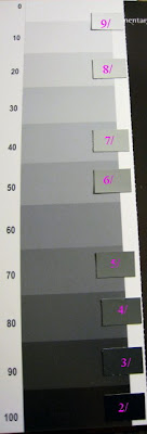
This scale is from the same book as the first example, Color Works: The Crafter's Guide to Color by Deb Menz. The back of the book has a number of handy pull out color tools including a gray scale. It's printed on glossy card stock, which might explain the differences between the arrangement of the Munsell chips on this scale and the first scale.

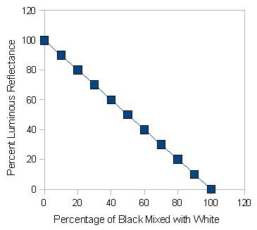
Note the unequal distribution of Munsell chips along the Menz value scale. Particularly at the high end of the value scale there seem to be a lot more grays in the Menz scale than the Munsell chips. Menz creates her value scale according to the percentage of black that has been mixed with white, from 0% (white) to 100% (black). In the value scale at left you can see the numbers along the left side of the value scale which indicate the percentage of black that has been mixed with white to form that particular gray. This gives us 11 different values.

On the Munsell Hue/Value/Chroma chart we have 9 rectangles and only 8 repositionable chips as representative samples for N 1/ (black) cannot be achieved in matte finish. Munsell created his gray scale based on ten visually equal steps between black and white. Because human perception of lightness is not uniform, a gray reflecting 50 percent of the light falling on it does not appear halfway between black and white. On the Munsell value scale, the middle gray, N 5/, reflects only 19.77% of the light. This is because people are much more sensitive to value differences between dark colors than they are to value differences between light colors.
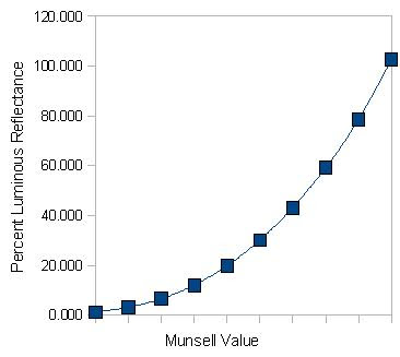
For this reason, the steps in the Munsell value scale have a geometric relationship to one another. Munsell would argue that Menz's gray scale does not appear uniform because the percentage of black that has been mixed with white increases in equal increments.


This value scale is from Art History by Marilyn Stokstad, which I'm reading with a couple of friends to make up for our failure to take art history in college. This value scale and some other basic tools to describe art are included in the Starter Kit section of the introductory material. For no particular reason that I can discern, values are divided into seven gradations including white and black at either end. Their correspondence, or lack there of, to Munsell value chips are apparent from the super out of focus picture.

Click here to see the rest of this post...

Friday, October 24, 2008

Munsell Exercise 1.3: Determining Values of Colors - Checking My Work

It's times like these where doing these exercises in a class would be both harrowing and helpful. I'm relieved I'm not being graded on my ability to determine the values of colors. But I would really like some feedback both on my technique and how to double check myself. Following, please find my thoughts on how to check the assessment of value of a color using an image editing program.

In my image editor of choice, GIMP, if I select Curves from the Color menu and look at the Value graph it appears that I have one big spike in value right around the middle and a tiny curved bump in the top quarter, which I'll blame on the non-green or gray portions of the image. This seems to confirm my guess as to the Munsell value of this green.

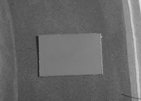
I have a few different options for turning color images into greyscale images. One option is to desaturate the image. There are three ways to desaturate an image: lightness, luminosity, and average. Desaturating by lightness has the exact same effect as selecting the Hue-Saturation option on the Color Menu and sliding the Saturation toggle to the bottom.

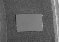
Desaturation by luminosity appears to confirm that the chip and the background are the same value.


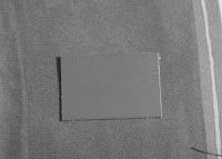
Desaturation by the average (I'm guessing the average of lightness and luminosity), as one might expect, results in an image about halfway between the relatively high contrast of the image desaturated by lightness and the very low contrast of the image desaturated by luminosity. Not sure it actually tells me much.


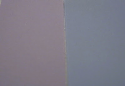
I started with the second example first because this first example is so clearly wrong. When I pull up the Value graph, I get at least two distinct bumps, implying I've got at least two distinct values in this image. If I were correct, there should only be one bump because the value of the blue background and the value of the gray chip should be the same. At least that's my layperson's understanding of the Curves/Value graph in GIMP.
I didn't even bother to run the average desaturation considering even the luminosity desaturation didn't make these two look like the same value.


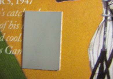
The original sample for this image included a lot of other colors than the one with which I was trying to work, so I trimmed out the other colors to check it. Just like the previous example, when I pull up the Value graph, I get two distinct spikes, implying I've got at least two distinct values in this image. If I were correct, there should only be one spike because the value of the orange background and the value of the gray chip should be the same.


But, unlike the blue example, this desaturation by luminosity actually looks pretty good. How can my Curve have two spikes, but my desaturation by luminosity looks almost as good as the first example?


Granted, the average looks a lot like the desaturation by lightness, implying that it's more different than it is the same, but it still seems like a closer match that the blue example.

Click here to see the rest of this post...

Wednesday, October 22, 2008

Still Life

There's a beautiful still life photograph, with some thoughts on still lives, over at my friend's blog.

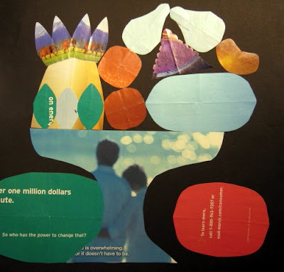
I have a hard time wrapping my brain around still life as subject. This is the closest I've come to crafting one myself. Unless you count that big painting of oranges in a bowl on a table, but it wasn't really about oranges on a bowl on a table. So I guess this is the closest thing I've come to consciously crafting a still life.


I made this collage in a design class with my first and favorite quilt instructor, Jeanne Benson. I think is was an exercise about shape and balance inspired by the way Baltimore Album quilt makers developed the designs for some of their blocks.

Tuesday, October 21, 2008

Munsell Exercise 1.3: Determining Values of Colors

In my ongoing exploration of color theory centered on The New Munsell(tm) Student Color Set, I've completed another exercise. This time the goal was to determine the Munsell value for a number of colors. Judging values of colors is always a challenge for me. First of all, I thought this was a grayed color. When compared to a chip of actual gray, it doesn't look grayed at all. The chip is Munsell(tm) value 3/, which was my best guess for the value of this color.


I did this exercise in one lighting situation and then when I went to photograph it in another lighting situation I realized my answers were WAY off for a few of them.

The green in this image - which is a tiny segment of a magazine reproduction of what I suspect is an acrylic painting - I suspect might be Munsell value 5/.


The yellowy-orange color from another tiny segment of the same painting in a magazine might be Munsell value 6/.


Under the six chips, this is a portion of Giorgio Morandi's "Natura Morta" (1954) as reproduced in the September 22, 2008, issue of The New Yorker magazine. If you click on the picture, you can see that I've labeled each chip with its value to indicate what I think the adjacent colors' values are.
Click here to see the rest of this post...

Friday, October 17, 2008

Works in Progress

A number of my favorite fiber arts bloggers post their works in progress regularly. For example, SharonB over at In a Minute Ago posts pictures of each crazy quilt block as she completes it. Vickie over at Field Trips in Fiber posts as a weekly fiber arts things to do list and shows the progress of her embroidery in her Handwork Wednesday posts. Joe the Quilter said during his workshop, the best way for him to get through a creative block is to have a deadline. I wonder if posting pictures of my works in progress will motivate me to complete them, like a deadline might.
This is a project started in a Sue Spargo class presented by the Bloomington Quilters Guild in the fall of 2007. Lots of applique to reckon with. I could just machine it - maybe using Sue Nickel's buttonhole stitch. I don't have a recipient in mind for this piece, so it gets bumped farther down the to-do list with every baby my friends have.
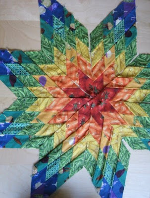
This is a lone star quilt started in a Jan Krentz class presented by the Indiana Heritage Quilt Show. I'm making it for a friend's baby boy, who is now almost eight months old. I have the fabric for the setting squares and the border and probably even the backing. The next step is to block all the diamonds. But I feel like I need to block the diamonds, cut the setting squares, and finish piecing the top all in one day or all the hard work of blocking those diamonds will be for nothing since they'll just get all wonky again sitting around my studio.
This is a set of New York Beauty blocks finished in a Jacquelyn Chiddister class at Shiisa Quilts. She worked well with students with VERY different levels of experience. I had never foundation pieced before. In addition to covering the class material, she willingly demonstrated all of the neat techniques she uses to create and embellish her beautiful quilts. I even got to pick out my fabrics with her! She has an amazing sense of color and pattern.
This is a precision patchwork block finished in a Julie Higgins class at Shiisa Quilts. I included the AA battery so you can get a sense of just how tiny this block is. Like Jacquelyn Chiddister, Julie Higgins worked well with students with VERY different levels of experience. But where Jacquelyn was happy to sew some beads on seams that didn't quite match, Julie was ready with her seam ripper to unsew and resew until it was just right. But she gave us so many excellent tips and tricks for working with small pieces and getting the points and intersections to line up, I don't remember unsewing even once. While I don't think I'd make a whole quilt of three inch blocks, I do think I'll apply the lessons I learned from Julie to every seam I sew. And the great thing about doing a three inch block: you can actually finish it in a three hour class!
This is an invisible machine applique block started in a Donna Stevens class at Shiisa Quilts. She is an excellent teacher. I’ve never taken a machine applique class before. She gave clear instructions and responded to questions with a wealth of knowledge. We made very helpful samples that will help me refresh my memory of the technique even after the project is complete. In addition to the class material, she demonstrated applique techniques that went beyond the project we worked on. The sample of the project hanging in the shop was done with homespuns, but Donna was very helpful with design decisions in a completely different pallet. This is only about 1/5 sewn down. I imagine the sewing won't take too terribly long. But I just have to sit down and do it.

I envision putting the New York Beauty blocks, the precision pieced block, and the invisible machine applique block together in one quilt top. I got the idea from Design Your Own Quilts by Judy Hopkins (That Patchwork Place, 1998), which my friend R.J. recommended. And now that I see the colors all together I'm tempted to back it with the top from the Joe the Quilter class, though it might be just too darned big. Eh, that's what ginormous borders are for.

Click here to see the rest of this post...

Wednesday, October 15, 2008

Joe the Quilter on Creativity

Sunday I took an amazing workshop with Joe Cunningham, a.k.a. Joe the Quilter. For a full review of the workshop qua workshop, please click here. Following please find pictures of the sixteen other 9 1/2" blocks I finished during class and some musings which might be called, "What I Learned about Creativity from Joe."

A guild member asked Joe whether his music influences his quilting, i.e. does his quilt musically. Joe answered that he quilts quiltingly. During the workshop I asked his a version of the same question, basically, does he employ this improvisational style due to his musical background. And the answer is no.

First, pre-20th century quilts by quilters with no documented history of musicality were improvisational. So you don't have to look outside the medium of quilting to ground your process in improvisation.

Second, Joe's relationship to music is in some sense based on virtuosity and external expectations - when he jams with a musician he really respects it is an anxiety ridden experience. But as a male in the female world of quilting, he is an outsider - no one knows what to expect from him. So he feels less anxiety. He finds quilting more freeing than music because of his outsider status. His improvisatory approach to quilting helps him turn off the judgmental part of his brain, which is hyperactive when he plays music.

His design process consists of placing fabric on his floor and taking away things until it pleases him. Joe doesn't have a design wall. But being well over six feet tall, he's probably far enough from the floor to get a fairly similar effect. He also uses a digital camera to view his designs.

Another benefit to - or side effect of - using a design floor instead of a design wall is that if you intend your quilt to be used, then it will most likely be viewed on a flat horizontal surface, not a flat vertical surface like a wall. I've heard from other quilt instructors who are also quilt judges that when judges look at quilts they're usually laid flat on a set of tables, like Joe's design floor. This tends to shift the judges' focus from the center of the quilt to the edges, which they can more easily see up close and get their hands on. And if you think of the quilts you use in every day life, you're probably very familiar with the top edge, but rarely contemplate the rest in much detail.

Another production aspect of Joe's process that impacts his creativity is his quilting. When he hand quilts he uses a standing floor frame and quilts from the outside in rather than from the center out, as one would with a hoop. Only a part of the quilt is visible at any one time.

This combined with the fact that he doesn't mark his quilts makes the overall quilting design less static and predetermined. It also makes finishing quilting more exciting because taking it off the frame reveals the whole quilt for the first time since he started quilting it. Also his frame set up basically limits him to quilting a 6" by 6' strip at a time, so many of his hand quilting motifs fill that space and repeat in rows.

When Joe rents time on a long arm machine, he takes a Jackson Pollack approach to quilting, moving the machine at random over the surface of the quilt. The result is dense all-over squiggles.
It's hard to determine whether this approach to quilting is due to a lack of interest in this stage of the process or developing improvisational techniques with a new tool.

During the workshop he mentioned that he'd like one of the long arm dealers to put his quilt top in one of their floor models so it could be quilted by all the different people test driving the machine. This leans toward lack of interest in the quilting phase. But it might be a step toward communal artistic production without mass production.

Joe calls some of his quilt designs conceptual. For example, for one of a series of quilts appliqueing bias tape to a whole cloth, he limited himself to using only the bias tape he could find at yard sales in one month. He only found four or five rolls of bias tape within those parameters. So it was a pretty spare quilt design. In another example of a conceptual quilt, he picked up a different Eucalyptus leaf off the ground each day and used it as a template for a fabric leaf which he then appliqued onto a whole cloth. This use of chance as a design parameter recurs in his work.

The workshop was essentially an exercise in conceptual design: apply a set of rules that will result in blocks. So what's the approach? It's a lot like Mona Brooks' Abstract Design Warm-Up from page 68 of Drawing with Children. Basically, you start with a piece of fabric approximately the size and shape of the quilt block you desire. We used a square, but I see no reason you couldn't start with a diamond or a triangle or a hexagon - any shape that can be tessellated. Then Joe presented two simple modifications to the block which totally reminded me of the Abstract Design Warm-Up's instructions,
Turn your paper in any direction you want.
Make three straight lines anywhere you want on the paper, but start the line on the edge of the paper and run it off another edge of the paper when you are done.


But where Abstract Design Warm-Up would just have you draw lines, in an exercise like Joe's each line would be cut with a rotary cutter and strips of fabric would be added before the next cut. Each cut is a creative act. Each fabric choice for a strip is a creative act.

The only thing that repeats with each block you make is the set of "rules" Joe set out for us (or that you've set out for yourself). How you execute that set of rules can vary with each block - so each block requires a set of creative decisions. Once you've squared up (or diamonded up or triangled up or tesselated shaped up - which, given the sort of odd shape you get from the improvisatory piecing stage, turns squaring up into another creative decision), the process of laying out the blocks was a heckuva lot more interesting than your usual quilt design as each block was unique. And Joe spent time with each student working through their layout. How rarely do quilt students get to that stage in the process so they can really get some practice?

We didn't know what the end result would be. He didn't show us a sample. Each student interpreted the set of rules differently, and Joe never steered anyone to a particular interpretation. Some people made every block identical. Some people used one fabric as the background fabric for every block, but executed the design prompts differently on each block.

I used the same three fabrics in each block and alternated which was the background to the block. I systematically differed each block based on the size of the corner triangle, the direction of the strip, and the width of the strip.
I was trying to make my blocks as different from one another as I could. This required some thought at the cutting, sewing, and squaring up steps. It wasn't truly just leaving it up to chance . . . which is so very like me.


I even fussy cut some of the strips to feature the design of the fabric.

Updated 10/18/08 to add: Joe blogged about the class and included a picture from the guild meeting of six completed tops from the workshop. It's a great picture that shows how different each quilt turns out even though they all started with the same design prompts.

Click here to see the rest of this post...

Friday, October 10, 2008

The Color of Heartache

Susanna Clarke describes colors amazingly in Jonathan Strange & Mr Norrell. For example on page 610 she writes,
The box was small and oblong and apparently made of silver and porcelain. It was a beautiful shade of blue, but then not exactly blue, it was more like lilac. But then, not exactly lilac either, since it had a tinge of grey in it. To be more precise, it was the color of heartache.
This has, of course, caused me to spend excessive amounts of time pondering my New Munsell Student Color Set for the color of heartache.

I've narrowed it down to somewhere between 5P 6/2 and 5PB 6/2. What do you think?

Sunday, October 5, 2008

Reflection

Wednesday, October 1, 2008

A Quilt with Secret Information Behind It

The Sunday New York Times Magazine last week had a short piece on Josiah McElheny, a sculptor inspired by the Big Bang Theory to create a series of installations. Some quotes from McElheny resonated with me. He described a piece as
sculpture with secret information behind it.
Later the article states
According to McElheny, physicists continue to struggle with the question "is the world this way because it must be, or is it just random?”
Previously, I'd worked on some paintings of raindrops that were asking similar questions about randomness. I've been contemplating creating some quilts exploring the same subject. Also combining the secret information and the unrandomness, I've been contemplating some quilts based on QR codes.